by Claire Barham
For small businesses all across the nation, getting their message in front of the local consumers tops the list of to-dos. And despite how popular digital advertising has grown in the past few years, it’s the consistency and trustworthiness of advertising in print media that remains at the heart of a small business marketing plan. And there’s plenty of research to back this up:
90% of adults in the U.S. read print magazines and the ads in these publications motivate 35% of readers to take action. – Businesswire
Magazines rank as the No. 1 platform for advertisers to engage with affluent consumers of all ages. – Shullman Research Center
If your small business is looking to launch an effective print advertising campaign and could use some guidance on best practices, you’ve come to the right place. The N2 Company team of graphic designers collectively creates more than 75,000 unique ads for advertising clients every year. We’ve been in the print media and advertising business for nearly two decades, and have learned the tricks of the trade when it comes to creating print ads that win the page and catch the reader’s eye.
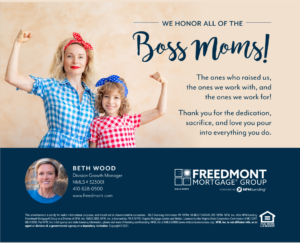
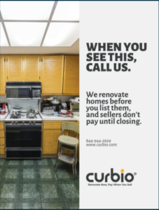
Ready to build your most effective print ad? Keep these fail-proof strategies (and examples!) in mind as your advertising campaigns begin to take shape.
1. Keep It Simple
If there’s any single piece of advice our expert designers can offer, it’s to grow comfortable with white space on your ad. In other words, you do not have to fill up every spot with copy or images. Let us repeat for good measure: you do NOT have to fill up every spot of ad space.
When you give the ad breathing room, it increases readability, makes it visually stand out, and gives the ad a higher-end look. “White space” in this context does not necessarily mean space that is white. It’s space on the ad that isn’t crammed with text or any other visual element that demands focus.

2. Keep It Readable
When it comes to font choices for your print ad, two things must be considered: the type of font(s) you use, and the size of the copy throughout your ad. Make sure the fonts used are legible, the font styling is consistent with your brand and corresponds with the message you are trying to send, and makes the intended impact.
A good rule of thumb is to stick with one or two font types throughout the entire ad. With more fonts added, you run the risk of the ad being visually exhausting to readers.
Because headlines are what you want readers to be drawn to most, feel free to get creative with the font and shoot for a larger font size. But the body copy should be smaller, clean, and in a very legible font.

Advertise with N2! View our print media brands.
3. Keep It Fresh
The golden rule for effective print advertising campaigns is consistency, consistency, consistency. Once you decide on a campaign theme, stick with it for a while to build brand recognition among the readers. For example, if you are advertising in a monthly print publication, keep the campaign theme consistent for at least a few months before switching gears.
But this tip is to “keep it fresh,” so we’re here to tell you that it is okay to make minimal changes to the ad every few months in order to keep it visually engaging. Small tweaks like switching out the image can help you win the page, month after month.
Another way to keep it fresh: Pay attention to timely tie-ins with your business that can increase the overall impact of your message. For example, if you have a winning message that’s appropriate for Mother’s Day, opt to switch up your ad for the May publication.

4. Keep It Unique
Stand out. What makes you different from your competitors? Stay away from what’s expected or typical from other businesses in your industry. Use your ad to show the reader how your business is unique… and why that matters.

And if you are a one-person team, print ads are an especially great way to really show your own personality. After all, customers do business with people, not logos! So make sure your ad communicates something about who you are and what you value.

5. Keep It Engaging
What is your ad driving readers to do? Every effective print ad must have a CTA – a “call to action.” Do you want the reader to give you a call? Visit your website? Register for your upcoming event? Recommend your services to their clients?
Often, but not always, the CTA is listed clearly toward the bottom of the ad. After you’ve hooked readers with the catchy visual and message of the print ad, be sure to reel them in with an easily understood call to action.

6. Keep It Hyper-Focused
What type of consumer are you trying to attract with your ad? If you can’t name and describe your target audience, you can’t create an effective print ad. This is something you need to know before you even agree to advertise in a print publication, or else you may be spending ad dollars to get in front of people who will never need your product or service.
Once you have your intended audience nailed down – age, gender, occupation, lifestyle, pain points, life goals, etc. – make sure the message of your ad is relatable and useful for them specifically. And the more targeted the message, the more it will resonate with the small group of people who are your top-tier prospective customers.

7. Keep It Easy – Work With A Graphic Designer
Designers are problem solvers by trade. If you are unsure of what your ideal audience would resonate with most or how to move forward with a particular idea, work with a professional designer. Not only will they be a huge help creatively, but they will also ensure the end product – a beautiful, relevant print ad – is the correct size and meets all other specifications so that your ad does not risk being rejected or altered.
Communication with your designer is key to achieving the result you want. Offer them as much information and direction as possible. Provide examples of ads you like (and tell them why), as well as ads you don’t like (and, again, tell them why!). And be prepared to provide them with necessary brand assets, such as your logo, brand colors, and any necessary legal disclaimers or copy that may need to be included on your ad.
If you are already investing a portion of your hard-earned marketing money in ad space, it’s often worth the additional cost to have your advertisement professionally designed so you know you’ll get the most bang for your buck.
At N2, we not only produce industry-leading, hyper-targeted print publications for communities all across the U.S., but we have a team of expert designers who create remarkable ads for our clients. Interested in getting your message in front of some of the most affluent readers in the nation? Discover what N2 publications are in your area.


